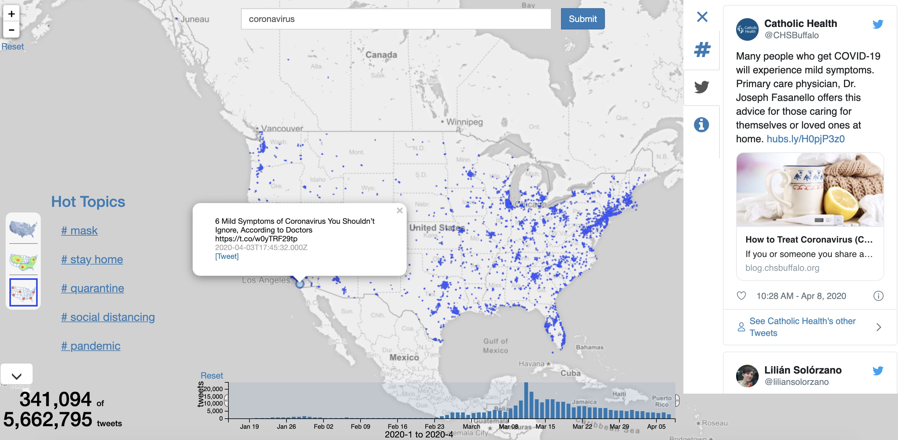
Coronavirus Twitter map developed at UCI displays social media reactions to COVID-19

To give the public a sense of how social media conversations about COVID-19 are happening in real time, UCI computer scientists have developed and launched a coronavirus Twitter map. The interactive resource visualizes the spatial and temporal distribution of tweets related to the pandemic, allowing users to view the growth and transformation of social media activity as the contagion spreads. The map is mainly focused on Twitter activity in the U.S. currently. “This tool gives people a way to locate discussions about the coronavirus within a region and in a time window,” said computer science professor Chen Li, who led a six-person development team. “We want the tool to help them gain insights on public discussions about this fast-evolving crisis, which can help government agencies and researchers in various domains, such as public health.” Visitors to the site enter keywords and are able to quickly visualize and explore related social media conversations. Backed by a continuously updated stream of data from Twitter, the system offers numerous levels of user customization. The main page is a scatter plot showing thousands of tweets on a map related to the term “coronavirus.” Viewers can switch to a heat map that illustrates the regions of particularly high discussion density or a choropleth map that displays aggregated tweet counts by state, county and city. Also available are location-based coronavirus case numbers obtained from external sources. The team consists of Ph.D. students Sadeem Alsudais, Qiushi Bai and Yicong Huang and undergraduates Shiqi Wu and Tiancheng “Joseph” Zheng, as well as Li. The system is powered by the Li-led Cloudberry and Apache AsterixDB projects in the Donald Bren School of Information & Computer Sciences. The project is supported by the National Institutes of Health, the National Science Foundation, the Orange County Health Care Agency, an ICS research award and the Google Cloud Platform research credits program.